Components
Add a new CSS file (e.g. avatar.css) in your components folder, copy/paste our CSS, then use the HTML code of the components wherever you want.
If you're in a Rails project, add a SCSS file instead (e.g. _banner.scss).
Most of the components have a dependency on Bootstrap (5.1) & Fontawesome, so make sure you have the libraries in your project.
Alert
<div class="flash flash-success alert alert-dismissible fade show" role="alert">
  <span><strong>Yay!</strong> 🎉 you successfully signed in to our service.</span>
  <a data-bs-dismiss="alert" aria-label="Close">
    <i class="fas fa-times"></i>
  </a>
</div>

<div class="flash flash-warning alert alert-dismissible fade show" role="alert">
  <span><strong>Mmh</strong> 🤔 seems like you don't have <a href="#">profile picture</a> yet.</span>
  <a data-bs-dismiss="alert" aria-label="Close">
    <i class="fas fa-times"></i>
  </a>
</div>

<div class="flash flash-danger alert alert-dismissible fade show" role="alert">
  <span><strong>Oops!</strong> 😱 a problem has occurred while processing your booking.</span>
  <a data-bs-dismiss="alert" aria-label="Close">
    <i class="fas fa-times"></i>
  </a>
</div>
.flash {
  padding: 16px 24px;
  display: flex;
  justify-content: space-between;
  align-items: center;
  background: white;
  box-shadow: 0 0 8px rgba(0,0,0,0.2);
  border-radius: 4px;
  margin: 8px;
}

.flash-success {
  border: 2px solid #1EDD88;
}

.flash-warning {
  border: 2px solid #FFC65A;
}

.flash-danger {
  border: 2px solid #FD1015;
}
Avatar
<img class="avatar" alt="avatar" src="https://kitt.lewagon.com/placeholder/users/cveneziani" />
<img class="avatar-large" alt="avatar-large" src="https://kitt.lewagon.com/placeholder/users/arthur-littm" />
<img class="avatar-bordered" alt="avatar-bordered" src="https://kitt.lewagon.com/placeholder/users/sarahlafer" />
<img class="avatar-square" alt="avatar-square" src="https://kitt.lewagon.com/placeholder/users/krokrob" />
<%= image_tag "https://kitt.lewagon.com/placeholder/users/cveneziani", class: "avatar", alt: "avatar" %>
<%= image_tag "https://kitt.lewagon.com/placeholder/users/arthur-littm", class: "avatar-large", alt: "avatar-large" %>
<%= image_tag "https://kitt.lewagon.com/placeholder/users/sarahlafer", class: "avatar-bordered", alt: "avatar-bordered" %>
<%= image_tag "https://kitt.lewagon.com/placeholder/users/krokrob", class: "avatar-square", alt: "avatar-square" %>
.avatar {
  width: 40px;
  border-radius: 50%;
}

.avatar-large {
  width: 56px;
  border-radius: 50%;
}

.avatar-bordered {
  width: 40px;
  border-radius: 50%;
  box-shadow: 0 1px 2px rgba(0,0,0,0.2);
  border: white 1px solid;
}

.avatar-square {
  width: 40px;
  border-radius: 0px;
  box-shadow: 0 1px 2px rgba(0,0,0,0.2);
  border: white 1px solid;
}
Card category
<div class="card-category" style="background-image: linear-gradient(rgba(0,0,0,0.3), rgba(0,0,0,0.3)), url(https://raw.githubusercontent.com/lewagon/fullstack-images/master/uikit/breakfast.jpg)">
  Breakfast
</div>
.card-category {
  background-size: cover;
  background-position: center;
  height: 180px;
  display: flex;
  justify-content: center;
  align-items: center;
  color: white;
  font-size: 24px;
  font-weight: bold;
  text-shadow: 1px 1px 3px rgba(0,0,0,0.2);
  border-radius: 5px;
  box-shadow: 0 0 15px rgba(0,0,0,0.2);
}
Card product
Product name
Product description with relevant info only.
<div class="card-product">
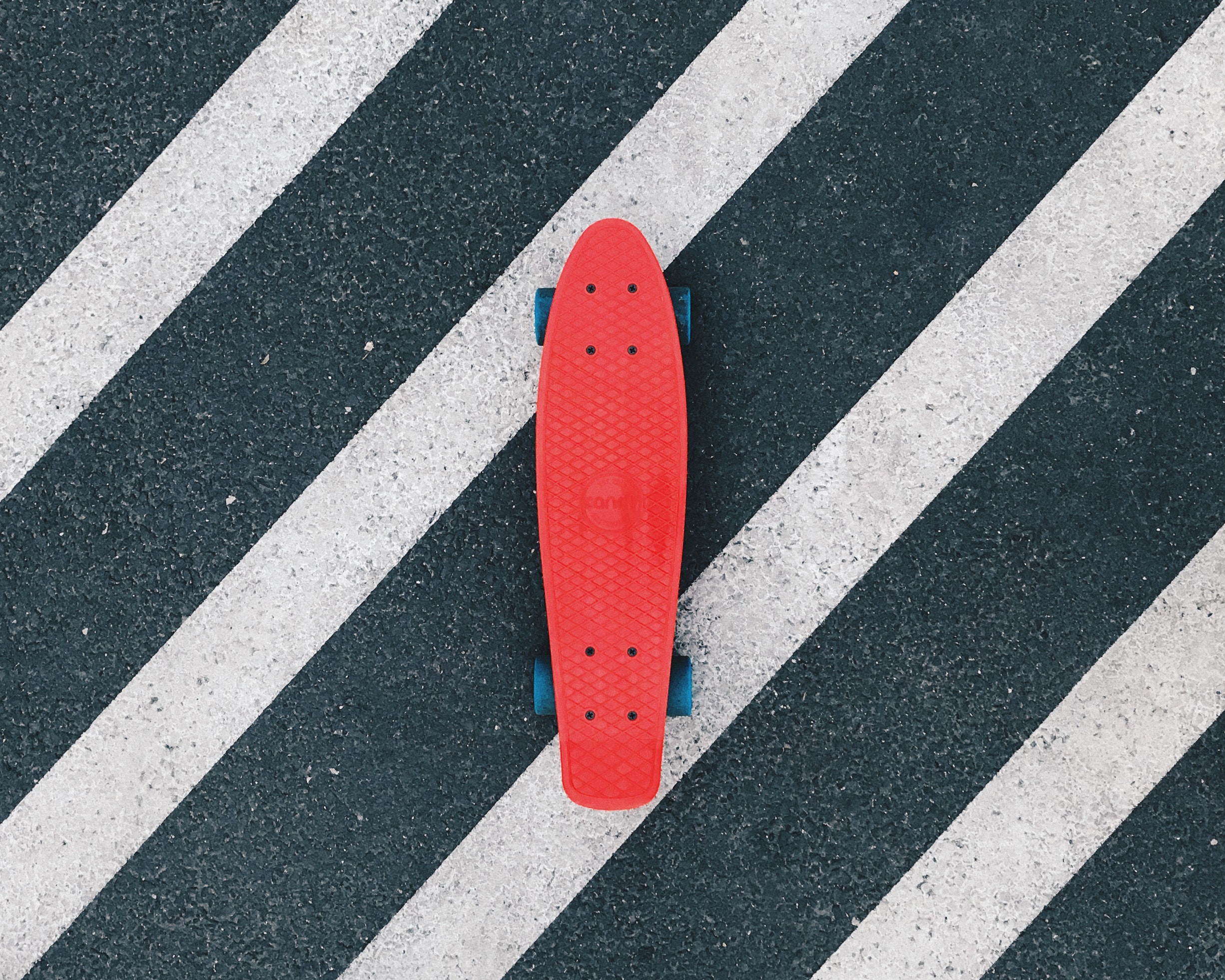
<img src="https://raw.githubusercontent.com/lewagon/fullstack-images/master/uikit/skateboard.jpg" />
<div class="card-product-infos">
<h2>Product name</h2>
<p>Product description with <strong>relevant info</strong> only.</p>
</div>
</div>
.card-product {
  overflow: hidden;
  height: 120px;
  background: white;
  box-shadow: 0 0 15px rgba(0,0,0,0.2);
  display: flex;
  align-items: center;
}

.card-product img {
  height: 100%;
  width: 120px;
  object-fit: cover;
}

.card-product h2 {
  font-size: 16px;
  font-weight: bold;
  margin: 0;
}

.card-product p {
  font-size: 12px;
  line-height: 1.4;
  opacity: .7;
  margin-bottom: 0;
  margin-top: 8px;
}

.card-product .card-product-infos {
  padding: 16px;
}
Card trip
⚠️ This component has a dependency on avatar.
Title here
Short description here!
£99.99
<div class="card-trip">
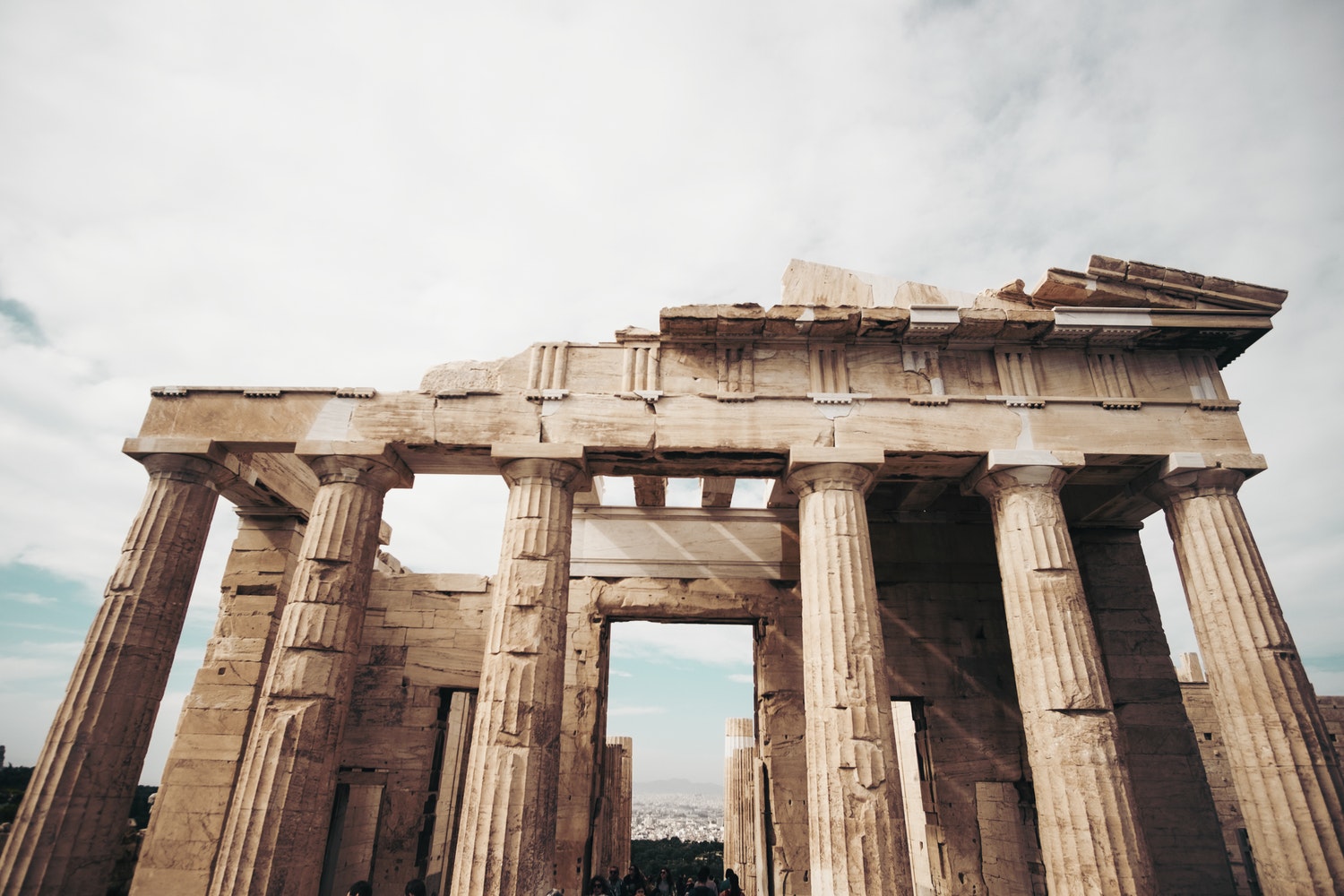
<img src="https://raw.githubusercontent.com/lewagon/fullstack-images/master/uikit/greece.jpg" />
<div class="card-trip-infos">
<div>
<h2>Title here</h2>
<p>Short description here!</p>
</div>
<h2 class="card-trip-pricing">£99.99</h2>
<img src="https://kitt.lewagon.com/placeholder/users/krokrob" class="card-trip-user avatar-bordered" />
</div>
</div>
.card-trip {
  overflow: hidden;
  background: white;
  box-shadow: 0 0 15px rgba(0,0,0,0.2);
}

.card-trip > img {
  height: 200px;
  width: 100%;
  object-fit: cover;
}

.card-trip h2 {
  font-size: 16px;
  font-weight: bold;
  margin: 0;
}

.card-trip p {
  font-size: 12px;
  opacity: .7;
  margin: 0;
}


.card-trip .card-trip-infos {
  padding: 16px;
  display: flex;
  justify-content: space-between;
  align-items: flex-end;
  position: relative;
}

.card-trip-infos .card-trip-user {
  position: absolute;
  right: 16px;
  top: -20px;
  width: 40px;
}
Navbar
‼️ Important: This is a static navbar. To enable the login/logout logic in your Rails project, uncomment the lines of the ERB code which are commented out below.
⚠️ This component has a dependency on avatar.
Notification
⚠️ This component has a dependency on avatar.
<div class="notification">
  <img src='https://kitt.lewagon.com/placeholder/users/arthur-littm' class="avatar-large" />
  <div class="notification-content">
    <p><small>14th January</small></p>
    <p>Lorem ipsum dolor sit amet, <strong>consectetur</strong> adipisicing elit.</p>
  </div>

  <div class="notification-actions">
    <a href="#">Edit <i class="fas fa-pencil-alt"></i></a>
    <a href="#">Delete <i class="far fa-trash-alt"></i></a>
  </div>
</div>

<div class="notification">
  <img src='https://kitt.lewagon.com/placeholder/users/Eschults' class="avatar-large"/>
  <div class="notification-content">
    <p><small>9th January</small></p>
    <p>Lorem ipsum dolor sit amet, <strong>consectetur</strong> adipisicing elit.</p>
  </div>

  <div class="notification-actions">
    <a href="#">Edit <i class="fas fa-pencil-alt"></i></a>
    <a href="#">Delete <i class="far fa-trash-alt"></i></a>
  </div>
</div>
.notification {
  display: flex;
  align-items: center;
  margin-bottom: 8px;
  background: white;
  padding: 8px 16px;
  border: 1px solid rgb(235,235,235);
}

.notification .notification-content {
  flex-grow: 1;
  padding: 0 24px;
}

.notification p {
  margin: 0;
  line-height: 1.4;
}

.notification small {
  color: #999999;
  font-weight: bold;
}
.notification .notification-actions {
  opacity: 0;
  display: flex;
  transition: ease .3s;
}

.notification:hover .notification-actions {
  opacity: 1;
}

.notification .notification-actions a {
  color: #999999;
  margin-left: 16px;
  font-size: 14px;
}

.notification .notification-actions a:hover {
  color: #555555;
}
Search form
⚠️ This component has a dependency on button.
<form novalidate="novalidate" class="simple_form search" action="/" accept-charset="UTF-8" method="get">
  <div class="search-form-control form-group">
    <input class="form-control string required" type="text" name="search[query]" id="search_query" />
    <button name="button" type="submit" class="btn btn-flat">
      <i class="fas fa-search"></i> Search
    </button>
  </div>
</form>
<%= simple_form_for :search, url: root_path, method: :get do |f| %>
<div class="search-form-control form-group">
<input class="form-control string required" type="text" name="search[query]" id="search_query" />
<button name="button" type="submit" class="btn btn-flat">
<i class="fas fa-search"></i> Search
</button>
</div>
<% end %>
.search-form-control {
  position: relative;
}

.search-form-control .btn {
  position: absolute;
  top: 8px;
  bottom: 8px;
  right: 8px;
}

.search-form-control .form-control {
  height: 3.5rem;
  box-shadow: 0 2px 6px rgba(0,0,0,0.08);
  border: 1px solid #E7E7E7;
}

.search-form-control .form-control:focus {
  border: 1px solid #1EDD88;
  outline: none !important;
  box-shadow: 0 2px 6px rgba(0,0,0,0.08);
}
Tabs
<ul class="list-inline tabs-underlined">
  <li>
    <a href="#" class="tab-underlined active">Bookings</a>
  </li>
  <li>
    <a href="#" class="tab-underlined">Requests</a>
  </li>
  <li>
    <a href="#" class="tab-underlined">Conversations</a>
  </li>
</ul>
.tabs-underlined {
  display: flex;
  align-items: center;
}

.tabs-underlined .tab-underlined {
  color: black;
  padding: 8px;
  margin: 8px;
  opacity: .4;
  cursor: pointer;
  text-decoration: none;
  border-bottom: 4px solid transparent;
}

.tabs-underlined .tab-underlined.active {
  opacity: 1;
  border-bottom: 3px solid #555555;
}
Layouts
Add a new CSS file (e.g. airbnb-show.css) in your pages folder, copy/paste our CSS, then use the HTML code of the layout wherever you want.
Cards grid
⚠️ This component has a dependency on card category.
<div class="cards">
  <div class="card-category" style="background-image: linear-gradient(rgba(0,0,0,0.3), rgba(0,0,0,0.3)), url(https://raw.githubusercontent.com/lewagon/fullstack-images/master/uikit/breakfast.jpg)">
    Breakfast
  </div>

  <div class="card-category" style="background-image: linear-gradient(rgba(0,0,0,0.3), rgba(0,0,0,0.3)), url(https://raw.githubusercontent.com/lewagon/fullstack-images/master/uikit/lunch.jpg)">
    Lunch
  </div>

  <div class="card-category" style="background-image: linear-gradient(rgba(0,0,0,0.3), rgba(0,0,0,0.3)), url(https://raw.githubusercontent.com/lewagon/fullstack-images/master/uikit/dinner.jpg)">
    Dinner
  </div>
</div>
.cards {
  display: grid;
  grid-template-columns: 1fr 1fr 1fr;
  grid-gap: 16px;
}

// Smallest device
@media (min-width: 100px) and (max-width: 575px) {
  .cards {
    grid-template-columns: 1fr;
  }
}

// Small devices (landscape phones, 576px and up)
@media (min-width: 576px) {
  .cards {
    grid-template-columns: 1fr;
  }
}

// Medium devices (tablets, 768px and up)
@media (min-width: 768px) {
  .cards {
    grid-template-columns: 1fr 1fr;
  }
}

// Large devices (desktops, 992px and up)
@media (min-width: 992px) {
  .cards {
    grid-template-columns: 1fr 1fr 1fr;
  }
}

// Extra large devices (large desktops, 1200px and up)
@media (min-width: 1200px) {
  .cards {
    grid-template-columns: 1fr 1fr 1fr;
  }
}